
Data Analysis
September 30, 2026
When the data changes, has reality changed?
Analysis of nearly 20 million faculty-years between 2020 and 2025 shows how changes in population composition and record production can alter the interpretation of a historical series

Between 2020 and 2025, the number of formal teaching positions identified in RAIS (Annual Relation of Social Information), from the Ministry of Labor, increased from about 2.58 million to 4.03 million. In the same period, there was an expressive transformation in the composition of these positions: statutory ones, which were 63.1% of the total in 2020, fell to 40.2% in 2025, while non-permanent or temporary public positions rose from 16.8% to 43.8%.
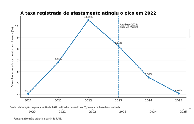
The data on sick leave also draws attention. The proportion of employment relationships with registered leave increased from 4.07% in 2020 to 10.54% in 2022, and then decreased, practically returning to the starting point: 4.08% in 2025.
At first glance, it would be tempting to conclude that, after a strong increase until 2022, there was a significant improvement in the following years. When the data are examined by type of employment, however, a result that is difficult to ignore emerges. Among non-permanent or temporary public employment, the registered rate goes from 8.47% in 2022 to only 0.41% in 2025.
What happened? Was there really a reduction of this magnitude in dismissals, or did the way in which this phenomenon came to be recorded change? This question illustrates a central problem in data analysis: not every change observed in a time series necessarily represents an equivalent change in the phenomenon we intend to measure. Before interpreting a result, it is necessary to understand how the data were produced.
Behind the numbers
The results were obtained from RAIS microdata, considering five occupational families related to teaching. The analysis covers all Brazilian states and tracks the characteristics of formal employment relationships, such as occupation, age, sex, type of employment, and records of leave due to illness.
There is an important distinction: the unit analyzed is not necessarily a person, but a work relationship. The same professor can have more than one relationship and, therefore, appear more than once in the database. For this reason, 4.03 million records in 2025 do not mean 4.03 million professors, but approximately 4.03 million teaching positions.
This difference seems merely technical, but it is essential. Administrative databases are originally produced for registration and management purposes. When they are used for data analysis, it is necessary to understand the meaning of each variable and, mainly, what each record represents.
Structure Transformation
Between 2020 and 2025, the number of teaching positions considered in the analysis increased by approximately 56%, from 2.58 million to 4.03 million. More important than the absolute growth, however, is observing how the composition of these positions has changed. In 2020, statutory public positions accounted for 63.1% of the analyzed records, while non-tenured or temporary public positions represented 16.8%. In 2025, the percentages changed to 40.2% and 43.8%, respectively.
If these numbers were observed in isolation, it would be possible to interpret the period as evidence of a rapid transformation in the structure of teaching work. But precisely in this interval, an important change occurred in the production of RAIS itself.
Data source
Starting from the base year of 2023, RAIS compliance is now measured solely by extracting events reported in eSocial for all declarant groups, including public agencies. The RAIS 2023 Technical Note records a significant break in the historical series and recommends that the results from that year not be directly compared with previous years, due to the transition process in data capture methods.
This does not mean that subsequent data are invalid or that all observed changes stem from eSocial. It means that the comparison requires caution. Instead of asking only why the numbers changed, it is necessary to ask how much of this change belongs to the phenomenon studied and how much may be related to the way it began to be recorded.
Attrition Data
In 2020, 4.07% of the analyzed links showed a record of leave. The rate rises to 6.83% in 2021 and reaches 10.54% in 2022, the highest value in the series. After that, it recedes to 8.25% in 2023, 5.50% in 2024, and 4.08% in 2025. There are two temptations in this reading. The first would be to automatically associate the 2022 peak with the effects of the pandemic. The second would be to interpret the subsequent drop as evidence of improvement in teachers’ health conditions. The data used here, in isolation, do not allow us to support either of these causal conclusions. What can be affirmed is more restricted: the leave indicator recorded in the database increased sharply until 2022 and fell in the following three years.
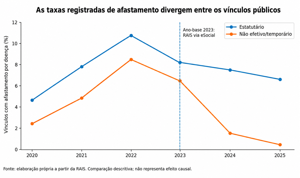
Among statutory public positions, the registered rate of leave increased from 4.63% in 2020 to 10.68% in 2022. It then decreased to 8.19% in 2023, 7.55% in 2024, and 6.59% in 2025. Among non-effective or temporary public positions, the trend is much more pronounced: 2.44% in 2020, 8.47% in 2022, 6.47% in 2023, 1.53% in 2024, and only 0.41% in 2025.
A reduction from 8.47% to 0.41% could produce an attractive headline. But we do not know, from these numbers, if teachers with non-effective appointments became less ill. What we do know is that the frequency with which absence is recorded in these appointments has dropped drastically. The difference is fundamental.
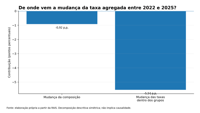
To investigate whether the general rate drop could be explained simply by the change in the composition of the links, the variation between 2022 and 2025 was decomposed into two parts: one associated with the change in the participation of different types of links and another related to the changes in the rates recorded within these groups.
The aggregate rate fell from 10.54% to 4.08%, a reduction of 6.46 percentage points. Of this total, approximately 0.92 percentage points are associated with the change in the composition of employment relationships, while 5.54 percentage points result from changes in the rates recorded within groups. In proportional terms, about 14% of the reduction is associated with composition, and approximately 86% with within-group changes.
Mathematically, the decomposition shows that the aggregate drop did not occur solely because the share of a certain type of link increased. But a statistical technique can correctly decompose what is recorded in the database and still not solve a measurement problem. If the way data is produced changed during the period, the decomposition will also reflect this change.
In 2020, the aggregate dropout rate was 4.07%. In 2025, it was 4.08%. Looking only at the two extremes, practically nothing seems to have changed. The decomposition tells another story: the change in the composition of employment relationships contributed approximately -1.15 percentage points to the rate, while changes in internal rates contributed in the opposite direction, with approximately +1.16 percentage points. The two movements practically canceled each other out.
Thus, 4.07% and 4.08% are almost identical numbers produced by quite different structures. Aggregate indicators are useful, but they can hide important transformations in the analyzed population.
What this case teaches
The RAIS case shows that a data analysis does not start with the algorithm. It starts with understanding the base. We could have observed the drop between 2022 and 2025, applied statistical techniques, and ended the analysis with an apparently consistent conclusion. The calculations would be correct. The problem would lie in the interpretation.
This problem is not exclusive to RAIS. A new filling rule, system migration, a classification change, the inclusion of new users, or a change in the mandatory nature of a certain field can create a break that, in a graph, looks exactly like a change in behavior.
Therefore, some questions should precede any more sophisticated model: did the observed population remain comparable? Did the definitions of the variables remain the same? Did the coverage change? Was there any alteration in the system that produces the records?
More data also do not necessarily mean more information. With millions of links, small differences can be calculated with enormous precision. But numerical precision and validity of interpretation are different things. If a variable starts to be recorded in a different way, millions of records can reproduce this difference with enormous consistency. Before asking “which model should I use?”, often the most important question is “what exactly is this data measuring?”.
The value of an unexpected result
The result of 0.41% could have been treated as a discovery. Instead, it served as a warning. Results that are very different from what was expected do not need to be discarded, nor should they be immediately turned into conclusions. They may indicate a relevant phenomenon, a processing error, a population change, a methodological alteration, or a characteristic of the source that we do not yet understand.
In this case, the analysis began as an exploration of millions of faculty links and ended up revealing something broader about the work with data itself: sometimes, the main finding is not in the number found, but in the reason why it should be examined with caution.
RAIS allows us to see important transformations in the Brazilian formal labor market and offers a wealth of information difficult to reproduce from other sources. The analysis identified expressive growth in teaching positions, relevant changes in their composition, and large fluctuations in records of sick leave between 2020 and 2025.
These results remain informative. What changes is the way to interpret them. The transition to eSocial shows why historical series should not be treated merely as sequences of numbers. Each point in a series is the result of rules, systems, definitions, and administrative processes that also have a history.
For those who work with Data Science, one of the main conclusions of this exercise is that, before explaining why an indicator has changed, one should verify if the same phenomenon continues to be measured in the same way.
An algorithm can find patterns in millions of records. Knowing whether these patterns represent the phenomenon we want to understand remains a human task.
| To access the references of this text click here |
Who wrote this column
José Erasmo Silva